
The New Editorial Card Web Part in SharePoint: A Game Changer?
Hey everyone, there’s a new web part in SharePoint that I think you’re going to love. It’s called the Editorial Card, and it’s designed to present information in a really eye-catching way. Let’s break down what this new web part is, why you might want to use it, and how to configure all the options.
What is the Editorial Card?

The Editorial Card is all about making your content stand out. Think of it as a single card-style layout that really pops on the page. It’s similar to one of the tiles on the Hero web part but without the need for the entire Hero layout. If you want something that draws attention and looks incredible, this is it.
Why Use the Editorial Card?
This web part is perfect for when you need to make sure someone sees your content. It’s visually appealing and a sign of things to come in terms of web parts. Whether you’re highlighting important news, announcements, or any other content, the Editorial Card makes it look amazing.
How to Configure the Editorial Card
Adding the Web Part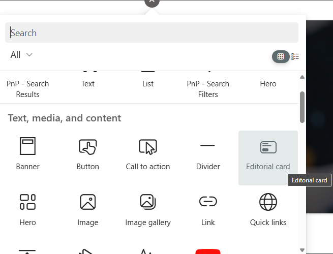
- Go to your SharePoint site and enter edit mode.
- Add the Editorial Card by clicking the plus button or using the new content pane to search for it.
- Drag the Editorial Card onto the page and start configuring it.
Configuring Layout Options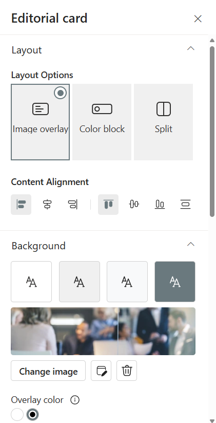
- The Editorial Card offers three out-of-the-box layout options, with more expected to come.
- You can change the alignment (vertical and horizontal) and choose between a colored background or an image background.
- For image backgrounds, you can configure an overlay of dark or white color and adjust the opacity.
Call to Action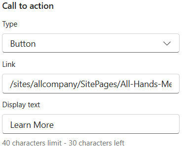
- The call to action is a button that prompts users to take action, such as reading more about a piece of news or linking to a form.
- You can make the entire card a call to action or just a button within the card.
- Configure the button text and link to ensure users know what action to take.
Adding Content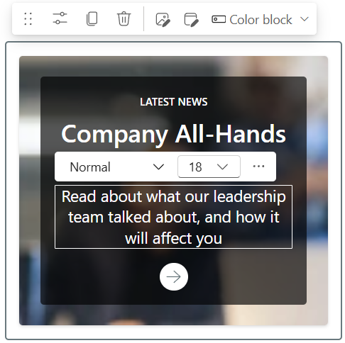
- Click inside the web part to add a category, headline, and description.
- Customize the font style, size, and color to match your site’s design.
Accessibility Options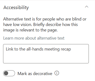
- Describe the image for screen readers or mark it as decorative if it doesn’t add context to the content.
Example Configurations
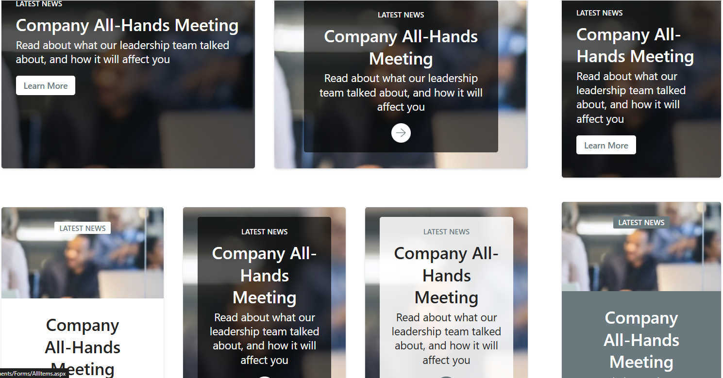 You can see how the Editorial Card looks in different section sizes and configurations on a sample page. Whether you use a one-column, two-column, or three-column layout, the Editorial Card adapts beautifully. The split option, where the image is on top and text below, is particularly striking.
Stay Updated with SharePoint
SharePoint is always evolving, and it can be challenging to keep up with the changes. To stay informed about new features and updates, consider subscribing to my SharePoint Insights newsletter. It’s free and keeps you in the know with all things SharePoint!
Explore the new Editorial Card web part and see how it can enhance your SharePoint pages. For more tips and tutorials, check out my dedicated SharePoint playlist on YouTube.
