
We’ve got some thrilling news that’s bound to transform your SharePoint experience. Say hello to SharePoint’s latest feature: flexible sections. If you’ve ever wanted for more control and creativity in designing your SharePoint pages, this update is for you.
What Are Flexible Sections?
Flexible sections are the newest addition to SharePoint, providing a dynamic, canvas-style space where you can drag and drop web parts, positioning them exactly how you want.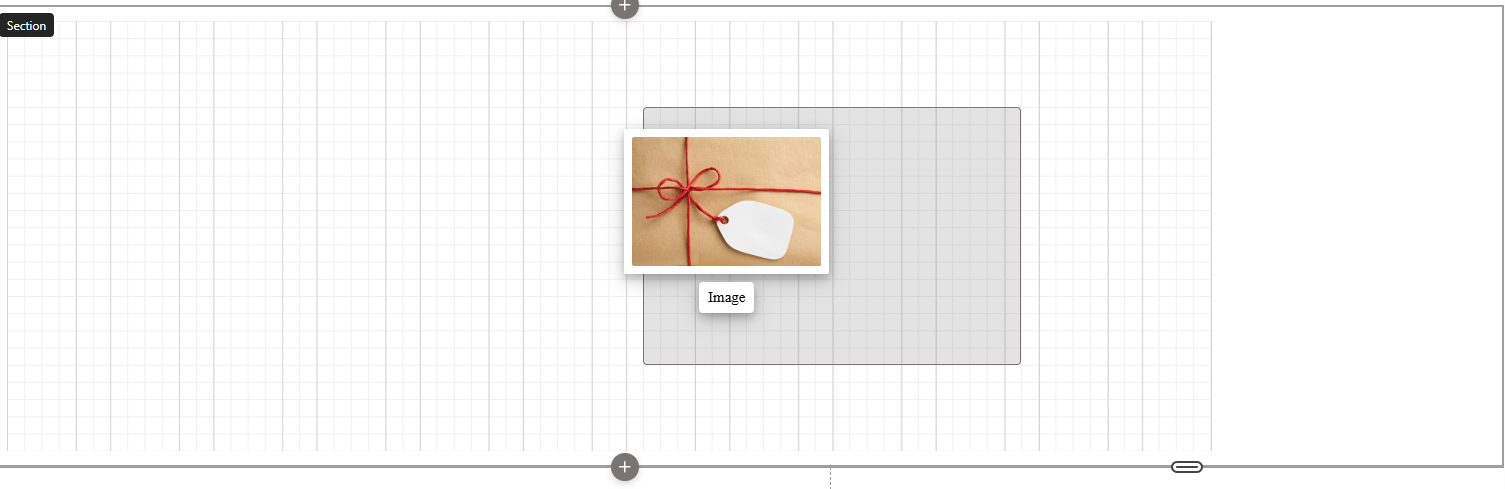 Imagine the freedom of arranging content without being confined to the traditional column layouts. Whether you’re familiar with Canva or other design tools, you’ll find flexible sections to be a powerful and intuitive feature.
How Do Flexible Sections Work?
Gone are the days of rigid layouts. With flexible sections, you start with a blank canvas. Simply drag web parts onto this space and align them using a handy grid pattern. Want to stack items on top of each other? No problem! Overlap, resize, and reposition to your heart’s content. The flexibility (pun intended) of this feature means you can create visually appealing pages with ease.
Let’s dive into a quick example.
Suppose you add an image web part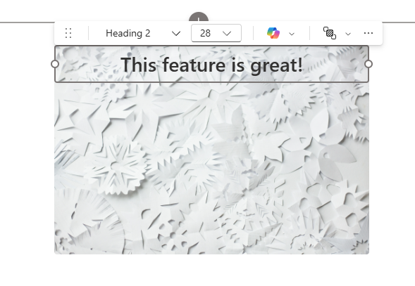 to your flexible section. You can drag it anywhere on the canvas, resize it, and align it with other web parts. Add a text web part on top, and you can style and format it to fit perfectly with the image below. The possibilities are endless.
Why Flexible Sections Are a Game-Changer
So, why all the excitement? Here are a few reasons:
- Creative Freedom: Break free from the typical constraints of predefined column layouts and design your pages with ultimate flexibility.
- User-Friendly: The drag-and-drop interface is perfect for users of all skill levels, making it easy to create professional-looking pages.
- Responsive Design: Flexible sections adapt beautifully to different screen sizes, ensuring your content looks great on any device.
- Enhanced Customization: Stack, overlap, and group web parts to create complex layouts. Resize and realign with ease to achieve your desired look.
Impact on Custom and Third-Party Web Parts
For those using custom or third-party web parts, flexible sections are designed to support them seamlessly. SharePoint framework (SPFx) 1.21 will introduce additional support, allowing web parts to respond appropriately within flexible sections. This ensures your custom elements integrate smoothly, maintaining a consistent and professional appearance.
Responsive Design and Mobile View
One concern many users have is how flexible sections will perform on mobile devices.
SharePoint’s flexible sections come with built-in responsive design features. You can control how web parts reorder on smaller screens, ensuring your content remains accessible and visually appealing. Whether it’s stacking elements top-to-bottom or left-to-right, flexible sections have got you covered. Microsoft has stated that additional options are coming as well!
Where Is This Feature Headed?
The introduction of flexible sections is just the beginning. Microsoft is continuously enhancing SharePoint, and we can expect to see more customization options and improvements. There’s even the possibility of integrating design tools like Figma, allowing you to import designs directly into SharePoint. Imagine creating stunning layouts in Figma and seamlessly converting them into SharePoint pages – the future looks AMAZING!
If you’re wondering how this would work, Figma allows you to design layouts just like on a canvas. You can position every element to perfection, bring items to the front, and send others to the back. Once satisfied with your design, you would import it into SharePoint, preserving all your meticulous arrangements. Microsoft’s vision for this level of integration clearly shows their commitment to providing users with potent, yet user-friendly, design tools.
Getting Started with Flexible Sections
Ready to give flexible sections a try? Here’s how to get started:
- Go to your SharePoint page
 and enter edit mode.
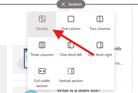
 - Select “New Section” and choose “Flexible” from the options.
- Drag and drop your desired web parts onto the canvas.
- Resize, reposition, and style your web parts using the available tools.
- Experiment with overlapping and grouping for more complex layouts.
Having a variety of section templates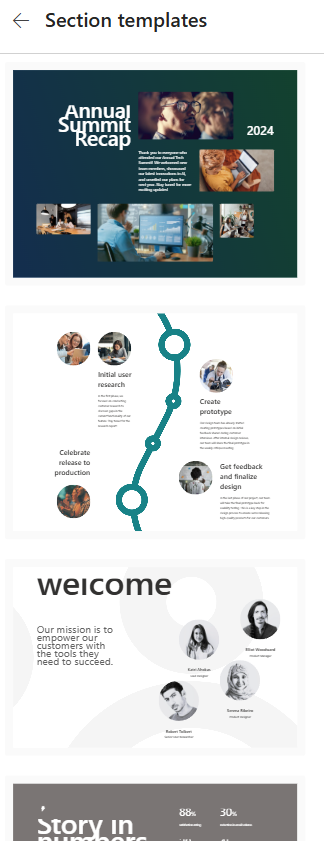 at your disposal also means you don’t have to start from scratch every time. These templates provide a great starting point with pre-arranged web parts that can be customized to suit your needs. This can be particularly useful for those who might feel overwhelmed by starting with a blank canvas.
It’s that simple! Whether you’re redesigning your intranet or creating new pages, flexible sections offer a world of possibilities.
Conclusion
Flexible sections are set to revolutionize the way we design SharePoint pages. With unparalleled creative freedom, user-friendly features, and seamless integration with custom and third-party web parts, there’s no limit to what you can achieve. Try out these new flexible sections today and watch your SharePoint pages come to life like never before.
Stay tuned for more updates, and don’t forget to subscribe to my YouTube channel for the latest SharePoint news and tutorials. Happy designing!
